mobile

Do users expect too much of applications?

Today, users expect more and more from their applications (both mobile and web).

In terms of performance, 47% of users now expect a page to load in 2 seconds or less. Apps like Instagram and Twitter set high expectations in terms of usability and functionality. And the cloud is everywhere – data is expected to be at our fingertips at all times.

As well as consumer expectations constantly rising, the expectations of businesses is also increasing. Now, anything that takes more than 3-6 months to start delivering real value is unlikely to get past the drawing board.

85% of businesses want to deploy apps within these time scales, but only 18% have processes in place to support this pace.

One solution Intechnica has recently adopted to meet and exceed these expectations is to adopt Rapid Application Development, which allows 80% of an application to be built using a drag-and-drop interface, leaving just 20% to traditional coding. This speeds up the development process to the point where a functional, useful web or mobile application can be deployed across various devices and delivering value to the business within weeks.

Case study – Delivering value within weeks

Intechnica, using Progress application development solutions, recently helped a leading European transport and logistics company to match the pace of business change by developing a mobile application to deliver new functionality within weeks, as opposed to the 3-6 months it would have taken using traditional application development methods.

The front-end of the company’s existing logistics, stock and order management application could not keep pace with the rate of change required to meet the new expectations of its users.

The solution was remarkably simple – but hugely effective. Today, smartphones are ubiquitous, so a simple mobile app was developed to replace several paper-based processes and mobilise the entire operation. GPS-based geolocation, time-stamping and photography functionality (all of which is available in almost every smartphone) was built into the app.

The business is now able to move with much greater pace and efficiency, enabling it to reduce costs and pro-actively manage its resource planning and invoicing functions with much greater accuracy.

The app was built, functional and delivering benefits to the business in just a matter of weeks.

Read more

Learn how businesses are addressing the increasing demand for faster development and time to value in an exclusive white paper produced by Intechnica. Head on over to the Intechnica website to download your copy now!

Performance Testing Mobile Apps: How to capture the complete end-user experience

Intechnica will be part of a live webinar presentation on August 26th (10am UK time) focused around the challenges of capturing mobile end-user experience in performance tests.

Today, so much emphasis is placed on end-user experience, particularly when it comes to mobile where end users expect the same level of performance from mobile apps as they do from web apps.

In the discipline of performance testing the end-user experience of mobile users is highly impacted by characteristics of the devices and the quality of the network. This makes it difficult for testers to accurately replicate production conditions with conventional testing tools and approaches.

Head of Performance Ian Molyneaux (author of “The Art of Application Performance Testing”, second edition available soon from O’Reilly) will join fellow performance testing expert Henrik Rexed (Neotys) to provide insights on:

  • What are the challenges of including mobile end-user experience in performance testing
  • What are the metrics you need to collect from the application, from the network and from the device
  • How to capture, correlate and analyse the relevant metrics and get a true picture of mobile app performance

Register now for the webinar, or if you can’t make it on the 26th, register anyway to receive a recording once available.


Ian Molyneaux and Andy Still

Velocity Europe 2014 registrations open, Intechnica speakers announced

O’Reilly have officially opened registrations for their annual Velocity Europe conference, taking place this year in Barcelona from 17-19 November, with two talks to be contributed by senior Intechnica staff.

Velocity Conference, which takes place each year in Santa Clara, New York, Beijing and Europe, is the premier Web Performance & Operations conference in the world.

We’re delighted that our CTO, Andy Still, along with Head of Performance Ian Molyneaux, will be speaking at the conference. Andy’s 40 minute session is entitled “Mobile Performance: When is Good Practice Irresponsible?”, while Ian will give a 90 minute “Performance Testing 101” tutorial closely tied to his recently published 2nd edition of “The Art of Application Performance Testing”.

Ian Molyneaux and Andy Still

Ian Molyneaux and Andy Still will be contributing a tutorial and session respectively at Velocity Europe 2014

An early bird discount rate is available for a limited time from the Velocity website, which also lists the announced schedule to date.

Which sessions are you looking forward to the most? Let us know in the comments.

Velocity Europe 2014

BT Sport app suffers performance nightmare on first day of Premier League

In an embarrassing “own goal” type gaff, BT Sport’s brand new app made victims out of its users this weekend, preventing many from watching the critical first game of the new season.

For football fans across the UK, Saturday was one of the biggest days of the year – the first day of the new season. It was also a big day for BT Sport, the new live sports offering from BT going head to head with Sky Sports.

One of the key elements to BT Sport’s offering are the apps for iOS and Android devices, which have been downloaded hundreds of thousands of times since its release over the summer.

Unfortunately for fans and the emergent broadcaster, the apps scored an own goal on the big day, preventing many from watching their favourite teams once the matches got underway.

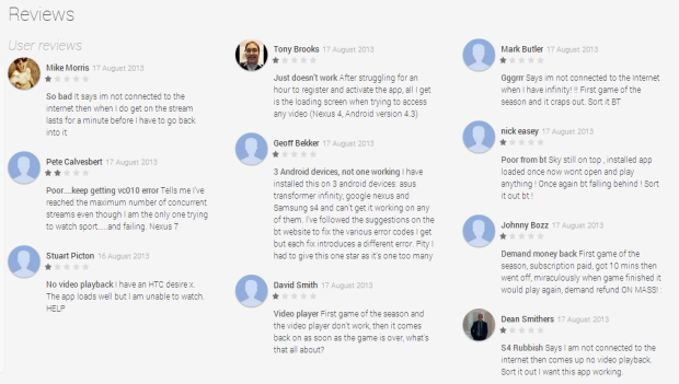
BT received a barrage of complaints via Twitter and in the form of negative reviews in each app store:

Unfavourable reviews of the BT Sports app in the Google Play store

Unfavourable reviews of the BT Sports app in the Google Play store

BT responded to many of the complaints directly on Twitter, and managed to fix the issues in time for the second half – but the damage was done for many users. It just goes to show that the performance of an app or website goes a long way in customer satisfaction and loyalty. And it’s an expensive mistake when research has shown that 88% of online consumers are less likely to return to a site after a bad experience.

Want to read about some other performance nightmares that caused headaches for businesses and their customers? Read our post “15 Web Performance Nightmares and the damage they caused“.

Why you can’t wait for 4G to speed up your retail site

How can you make your site faster for mobile users?

On 30th October 2012, 4G was rolled out in the UK to customers of mobile network EE.

4G, the fourth generation of mobile services, promises broadband-speed data connections for mobile devices.

For now this EE exclusive offering is very much a premium product, not only because of the pricing model and device restrictions, but also because it’s only available in 10 cities currently. This dramatically limits the number of people who can actually make use of the superfast speeds “on the go”.

Recently, eBay warned that the lack of speedy mobile shopping experiences could cost the UK economy £120m this Christmas according to an article on internetretailing.net, and this could have been avoided by more widespread 4G coverage and adoption – but is 4G really the “magic bullet” to cure sluggish, unresponsive online shopping experiences?

Retailers see increased network speeds as an opportunity to add more elements to pages, particularly on mobiles and tablets. But this doesn’t necessarily match up with the public’s expectations with site speed – the top barriers to mobile shopping success will still be down to speed and reliability.

Retailers should not make the mistake of waiting for 4G to solve the speed issue for them – they can see significant results right now, from desktop through to mobile site performance. A one second page delay can cause a 7% reduction on conversion rates, so taking a serious look at your site’s performance is well worthwhile.

We recently released our whitepaper “Faster Websites = More Revenue” for free download. It features a fantastic overview of why performance is important, clear advice on how to improve it for your own retail site and the potential gains to revenue you’ll see as a result. If you’d like a copy, click here to visit our website.

Persistent Navigation in jQuery Mobile

I have been doing quite a bit of work in mobile application development with jQuery Mobile recently, and generally finding it a very useful product once you get your head around its idiosyncrasies.

One of the things I needed to do was to have a persistent navigation across the bottom of the page, to mimic the standard iPhone navbar.

Out of the box jQuery Mobile offers a facility for persistent navbars.

Read the rest of this post, including code explanations, on Andy’s “Internet Performance Expert” blog: Persistent Navigation in jQuery Mobile

Mobile Web design & HTML5: Setting the standard

Tablet computers and mobile devices are becoming ingrained in society. Image credit: Mike Licht, NotionsCapital.com

As the tablet and mobile market continues to grow, fuelled by the hotly anticipated release of new versions such as the (new) iPad (3) and Android 4.0 (Ice Cream Sandwich), businesses are realising that the trend towards consumers buying online through an increasing number of devices (or m-commerce) is only going to grow with it. Recent studies have shown that conversion rates are much higher from mobile devices and tablets than on traditional platforms; a customer who visits a website or e-commerce application through such a device is already showing a certain level of increased engagement with the retailer. Customers using tablets spend more (up to 10 or 20 percent in some cases) than those using desktop computers, other studies have shown.

Retailers and other businesses dependent on their online systems for revenue must carefully consider these users, and make sure they are being properly catered for. A recent study published by Gomez, a division of Intechnica partner Compuware, showed that the top complaints of tablet users when viewing websites were slow load times, site crashes & errors, and problems with the format of the site. These bad experiences drive users away to competitor sites, and increase the risk of them never returning to your site.

The traditional building blocks for websites were simply not made to cope with screens than switch between portrait and landscape, relatively tiny or irregular screen resolutions, or touch screen actions. Performing tasks or even simple navigation of websites under these conditions can be a frustrating experience, where usability needs to be turned into an advantage. After all, shopping via mobile devices is often triggered by impulse, making for easy sales as long as the process is as simple as possible. In the past, shopping cart abandonment has been relatively high for these platforms, and part of this has to be down to the fact that many websites were not designed with these platforms in mind; nobody likes having to scroll across both axis and zooming in and out just to be able to touch the right button on a site. The solution lies in intelligently developing websites and applications to be compatible with these varying devices, platforms and screen sizes.

While old internet architecture was not built with such devices in mind, the latest set of standards, HTML5, is designed precisely for that reason. Rather than rebuilding a whole website, or building a separate site for each device (after all, each device will have different resolutions to contend with and a “mobile” version does not ensure compatibility on all devices), designers and developers can rewrite portions of a site in HMTL5, CSS3 and Javascript. While no browser currently supports every feature of the still developing HTML5 standard, it allows one single website to adapt across devices automatically via responsive design, making it much more “mobile friendly”. For example, sidebar content is automatically shifted to the bottom of the page, allowing the main article to span across the screen. This is a clever solution where “screen real estate” is reduced on smaller devices. HTML5 is also designed to be “touchscreen friendly”.

m-commerce is growing as more people take up the technology. Image credit: Per Olof Forsberg

HTML advancements aside, there are still many considerations to make when “mobifying” or “tabletising” a website or application. Even with a responsive design, where content shifts itself around to compensate for the screen resolution without compromising readability, in many cases there is simply not enough room on the screen to feasibly show everything. This is where careful consideration needs to be made on what is necessary to be shown on the site, and in some cases, where it would actually be more appropriate to shrink the content down and encourage zooming and scrolling. You could also try to think outside of the box; a wide table of data might need to be scrolled in portrait mode, but users could be able to view it more easily if flipped into landscape mode. It is even possible to show data in completely different ways depending on the size of the screen (see some clever examples here and here).

The considerations are different for each individual website or application, but as the new web standards develop, more and more opportunities to innovate are opening up. In the end, it’s all about ensuring quality and high performance for the end user, regardless of where they are or what they are using.